Quibi
Quibi is a video streaming platform with a unique spin on short format, mobile-phone-only content. As the number of streaming platforms seems to grow almost daily, I decided to give Quibi a shot and found a few clever and interesting design patterns. I also discovered that recoding my iPhone screen while watching a video did not work, and resulted in a blank screen (which makes total sense) so I resorted to screenshots in those situations.
Turnstyle video
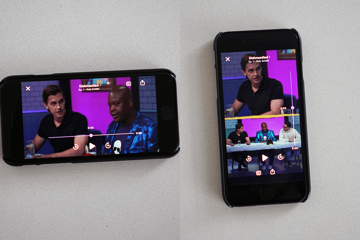
Probably the most hyped feature is the Turnstyle video tech that flips between vertical and horizontal framing as you turn your phone. Vertical format video feels natural in apps like Instagram or TikTok, but majority of the content is made for this orientation. Holding your phone vertically may be more comfortable but, I personally don’t see the need for watching videos vertically that were filmed widescreen. If nothing else it is a cool feature to explore, and it does more than just crop content to the centre of the frame. There are a couple things that stood out to me when changing orientations:
The speaker is always in the shot when viewing vertically no matter where they are in the horizontal frame. The layout of any graphics also adapts to the frame with labels, text and graphics changing position. If the entire frame is important (think speakers panel) in the horizontal view, in vertical mode the frame is split in half.
Video controls
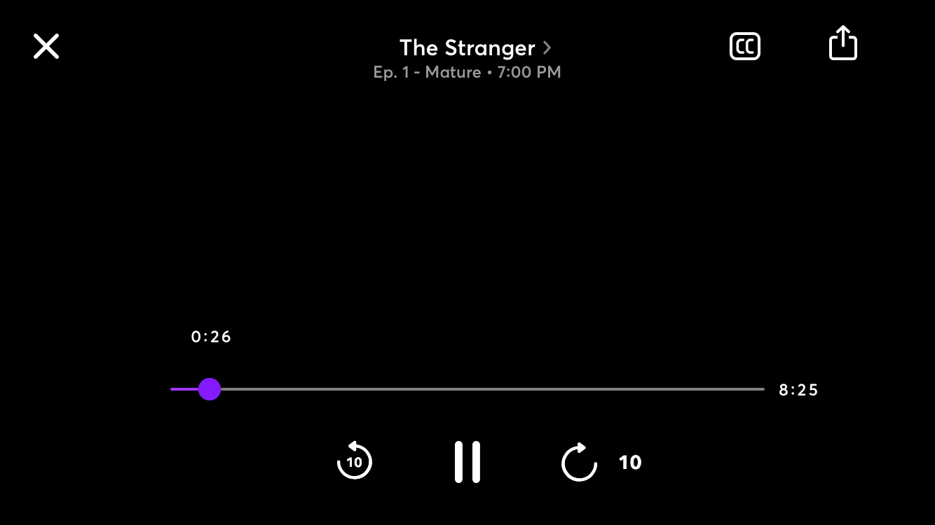
The in-video controls are standard and do what you’d expect, except for the share icon which just lets you share a link to the homepage of a show. I was expecting more here, like the ability to share a snippet of content to social media or share what I’m watching to another screen. I do like the animation of the 10s forward and rewind controls, very similar to Netflix, but the animation here is smoother and feels nicer. Multiple taps add up the skip time here as well.
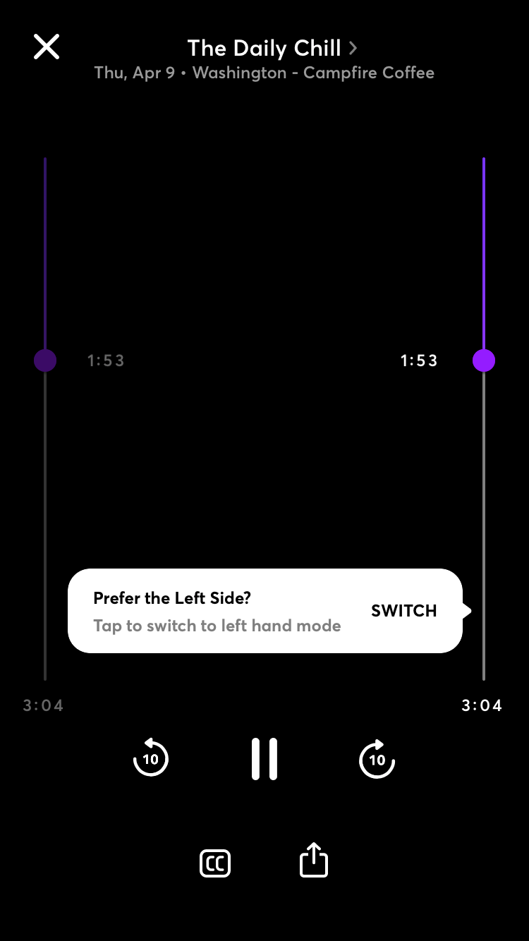
In vertical mode the video scrubber is anchored to the right of the frame by default, with the option to flip between left and right handed mode. Typically being at the bottom, this originally struck me as odd but I do think it has advantages and I think I actually prefer it. Having the bar along either side of the screen makes it easier to interact with compared to scrunching your thumb near the bottom. The bar can also be longer giving you finer control over finding a specific frame.
Home cards
Cards are the primary UI element for video content. The Recommended for you default landing page contains all of the featured/recommended items. There isn’t a ton of content on Quibi yet, and I think the designers made a good design decision in how the user makes their way through the list. The interaction here is that you flick your way through the cards one by one. This in a way forces you to pause and consider each item for at least a moment, and makes it feel like there is a lot of stuff to flip through. If you do pause on a card, the background seamlessly transitions to play a snippet of the content.
In contrast, flipping through many cards at once requires a huge swipe gesture from the bottom with a lot of momentum (it feels a little awkward), even then it only skips a few cards in between. In Instagram for example, which is an endless stream of content this gesture would send you flying through posts.
In case you do want to move through content quickly there is a scrollbar you can drag but interacting with it can be a bit finicky, you have to press and hold to grab it, which often times brings up the More Info screen of whatever video is next to it. Perhaps a larger tap area on the bar might help.
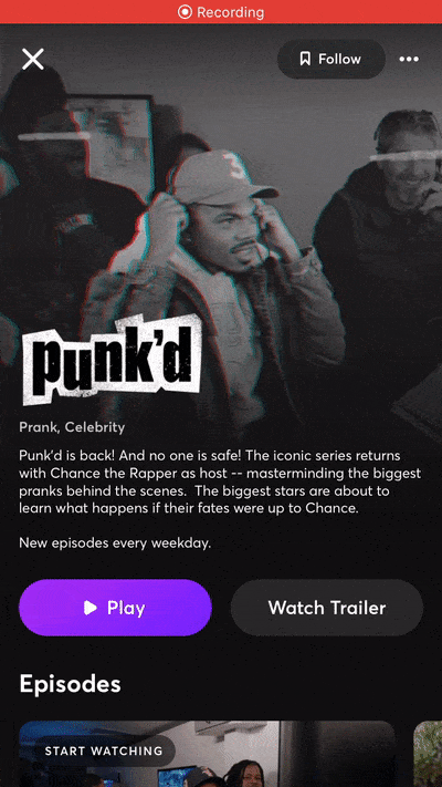
Show logos
Each show has a unique logo that is a prominent feature on its card and detail page. As you scroll the logo shrinks proportionately and then anchors itself in the header. This works surprisingly nicely with different formats and sizes of logos.
Additional actions
One interaction I really like is that you can exit a video with a simple downward swipe. This is a lot quicker and feels more natural than reaching for the x to close. This pattern seems to be used on all pop-overs and cards with an x icon.
A tiny nitpick I have is the use of ellipsis to access a pop-over with only a singe item. Download Settings is one example of this pattern. Alternatively the settings icon could be used in place of the ellipsis and the user could access the settings with a single tap.
Thanks for reading :)